
Modernizing juno.one: Product Website Redesign & Positioning
Overview
juno.one is a project and test management platform designed for software teams that need structured workflows, integrated testing, and traceability across development cycles.
The original website no longer reflected the product’s evolution. The application interface had undergone a significant UI upgrade, but the marketing site still used outdated visuals, messaging, and structure. As a result, the website struggled to clearly communicate the platform’s value and differentiate it from competitors like Jira, ClickUp, or Linear.
The redesign aimed to modernize the brand, improve product storytelling, and create a marketing website that accurately represents the product experience.
Client
juno.one
Timeline
2024
Tools used
Figma
Google Analytics
Jitter
Illustrator
Problem
The previous website suffered from several structural and communication issues:
Outdated visual design
The website did not match the modernized UI of the product, creating a disconnect between marketing and the actual platform experience.
Unclear product positioning
The platform combined project management, test management, and collaboration tools, but the website did not clearly communicate how these capabilities worked together.
Weak product storytelling
Features were listed individually rather than explained through workflows and real use cases.
Inconsistent brand identity
Visual language and interaction patterns differed from the product interface, weakening brand consistency.
My role
I led the redesign end-to-end as the sole designer.
Responsibilities included:
Conducting competitor research and analyzing positioning strategies
Interviewing users to understand product adoption drivers
Reviewing analytics to identify engagement issues
Redefining information architecture and messaging
Designing the entire marketing website and subpages
Creating a visual system aligned with the product UI
Designing interactive product previews
Building documentation pages in Markdown within the CMS provided by developers
The goal was to create a cohesive product narrative that would clearly communicate the platform’s value to software teams.
Actions
1. Competitor Research
To understand how similar tools communicate their value, I analyzed websites of key competitors including Jira, ClickUp, Monday, and Linear.
The analysis focused on:
product positioning
feature presentation
onboarding messaging
visual storytelling
conversion flows
A key observation was that successful competitors emphasize product workflows and outcomes, not just feature lists.
2. Information Architecture & Messaging
Based on research insights and user interviews, I restructured the website architecture.
The new structure focused on:
product-first messaging
clearer explanation of key workflows
grouping related features into meaningful categories
simplifying navigation and content hierarchy
This approach helped translate complex platform capabilities into understandable product stories.
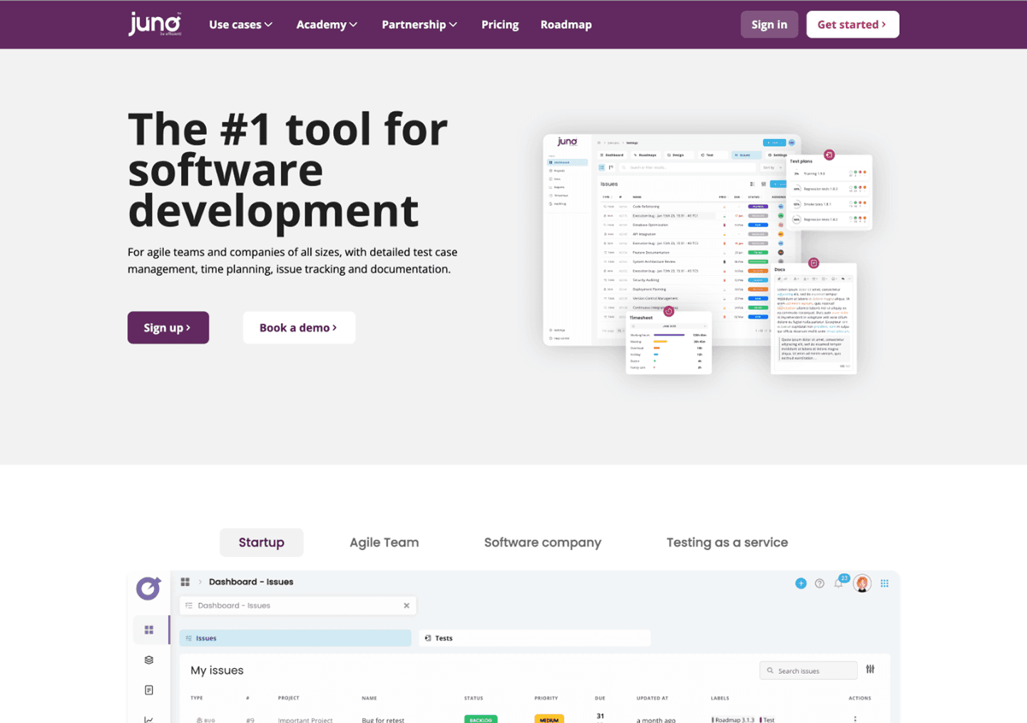
3. Product-First Homepage
Instead of marketing-heavy messaging, the homepage was redesigned to highlight the product itself.
Key elements included:
clear value proposition for software teams
product interface previews early in the page
explanation of how project management and test management work together
visual breakdown of core capabilities
This approach helps visitors quickly understand what the product does and why it matters.
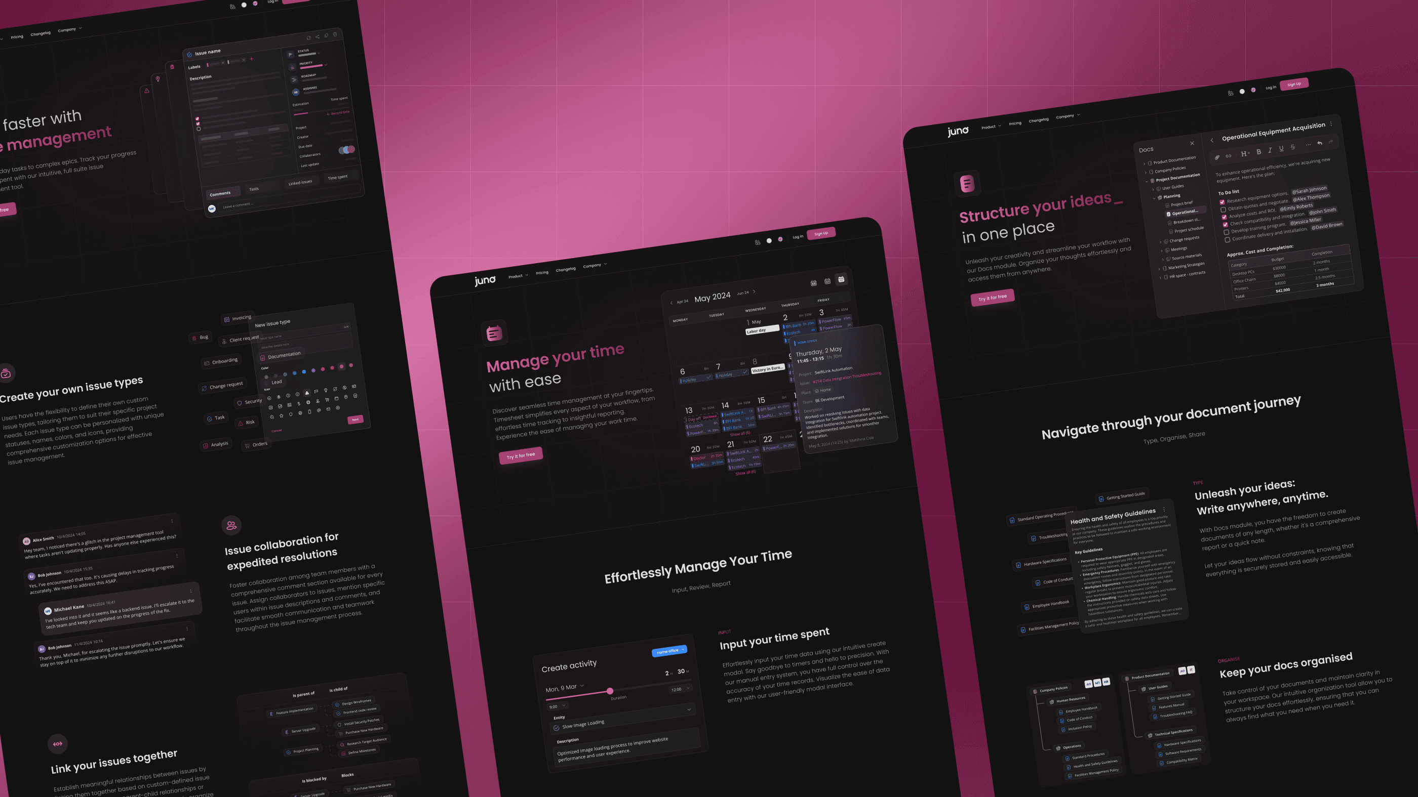
4. Interactive Product Previews
To better communicate the platform experience, I designed product interface previews that simulate real workflows.
These previews illustrate:
project tracking
test management workflows
traceability between tasks and tests
The goal was to reduce the gap between marketing and the real product experience.
5. Modular Feature Storytelling
Rather than presenting long feature lists, the new website introduces features through modular sections.
Each module explains:
the user problem
the relevant feature
the outcome for teams
This structure allows the site to communicate complex capabilities while remaining easy to scan.
6. Visual System Aligned with Product UI
To ensure consistency, I created a visual system derived from the product interface.
This included:
consistent color system
shared UI elements
product-based imagery
simplified layouts focused on clarity
Aligning marketing and product visuals strengthened the brand and improved perceived product quality.
7. Writing Documentation Experience
As part of the redesign, I also created the product documentation. Developers set up the initial environment using Nuxt Studio, including page linking and basic placeholders.
From there, I took ownership of the documentation experience — defining the structure, writing the full content in Markdown, organizing the content hierarchy, and preparing all supporting visuals.
The result was a structured knowledge base designed to help users quickly understand the platform and navigate its features.
Results
The redesigned website improved how the product is presented to potential users and stakeholders.
Key outcomes included:
more positive internal feedback from product and marketing teams
higher engagement across product pages
reduced bounce rate on key landing pages
The redesign also established a scalable foundation for future product marketing and documentation.

Learnings
Designing marketing websites for complex SaaS platforms requires balancing technical depth with clarity.
Working closely with product and marketing teams helped translate complex features into understandable narratives for prospective users.
This project reinforced the importance of aligning marketing experiences with the product itself — especially in product-led SaaS environments.


Full frame

Modernizing juno.one: Product Website Redesign & Positioning
Overview
juno.one is a project and test management platform designed for software teams that need structured workflows, integrated testing, and traceability across development cycles.
The original website no longer reflected the product’s evolution. The application interface had undergone a significant UI upgrade, but the marketing site still used outdated visuals, messaging, and structure. As a result, the website struggled to clearly communicate the platform’s value and differentiate it from competitors like Jira, ClickUp, or Linear.
The redesign aimed to modernize the brand, improve product storytelling, and create a marketing website that accurately represents the product experience.
Client
juno.one
Timeline
2024
Tools used
Figma
Google Analytics
Jitter
Illustrator
Problem
The previous website suffered from several structural and communication issues:
Outdated visual design
The website did not match the modernized UI of the product, creating a disconnect between marketing and the actual platform experience.
Unclear product positioning
The platform combined project management, test management, and collaboration tools, but the website did not clearly communicate how these capabilities worked together.
Weak product storytelling
Features were listed individually rather than explained through workflows and real use cases.
Inconsistent brand identity
Visual language and interaction patterns differed from the product interface, weakening brand consistency.
My role
I led the redesign end-to-end as the sole designer.
Responsibilities included:
Conducting competitor research and analyzing positioning strategies
Interviewing users to understand product adoption drivers
Reviewing analytics to identify engagement issues
Redefining information architecture and messaging
Designing the entire marketing website and subpages
Creating a visual system aligned with the product UI
Designing interactive product previews
Building documentation pages in Markdown within the CMS provided by developers
The goal was to create a cohesive product narrative that would clearly communicate the platform’s value to software teams.
Actions
1. Competitor Research
To understand how similar tools communicate their value, I analyzed websites of key competitors including Jira, ClickUp, Monday, and Linear.
The analysis focused on:
product positioning
feature presentation
onboarding messaging
visual storytelling
conversion flows
A key observation was that successful competitors emphasize product workflows and outcomes, not just feature lists.
2. Information Architecture & Messaging
Based on research insights and user interviews, I restructured the website architecture.
The new structure focused on:
product-first messaging
clearer explanation of key workflows
grouping related features into meaningful categories
simplifying navigation and content hierarchy
This approach helped translate complex platform capabilities into understandable product stories.
3. Product-First Homepage
Instead of marketing-heavy messaging, the homepage was redesigned to highlight the product itself.
Key elements included:
clear value proposition for software teams
product interface previews early in the page
explanation of how project management and test management work together
visual breakdown of core capabilities
This approach helps visitors quickly understand what the product does and why it matters.
4. Interactive Product Previews
To better communicate the platform experience, I designed product interface previews that simulate real workflows.
These previews illustrate:
project tracking
test management workflows
traceability between tasks and tests
The goal was to reduce the gap between marketing and the real product experience.
5. Modular Feature Storytelling
Rather than presenting long feature lists, the new website introduces features through modular sections.
Each module explains:
the user problem
the relevant feature
the outcome for teams
This structure allows the site to communicate complex capabilities while remaining easy to scan.
6. Visual System Aligned with Product UI
To ensure consistency, I created a visual system derived from the product interface.
This included:
consistent color system
shared UI elements
product-based imagery
simplified layouts focused on clarity
Aligning marketing and product visuals strengthened the brand and improved perceived product quality.
7. Writing Documentation Experience
As part of the redesign, I also created the product documentation. Developers set up the initial environment using Nuxt Studio, including page linking and basic placeholders.
From there, I took ownership of the documentation experience — defining the structure, writing the full content in Markdown, organizing the content hierarchy, and preparing all supporting visuals.
The result was a structured knowledge base designed to help users quickly understand the platform and navigate its features.
Results
The redesigned website improved how the product is presented to potential users and stakeholders.
Key outcomes included:
more positive internal feedback from product and marketing teams
higher engagement across product pages
reduced bounce rate on key landing pages
The redesign also established a scalable foundation for future product marketing and documentation.
Learnings
Designing marketing websites for complex SaaS platforms requires balancing technical depth with clarity.
Working closely with product and marketing teams helped translate complex features into understandable narratives for prospective users.
This project reinforced the importance of aligning marketing experiences with the product itself — especially in product-led SaaS environments.
Full frame

